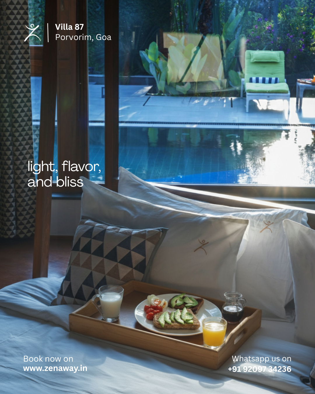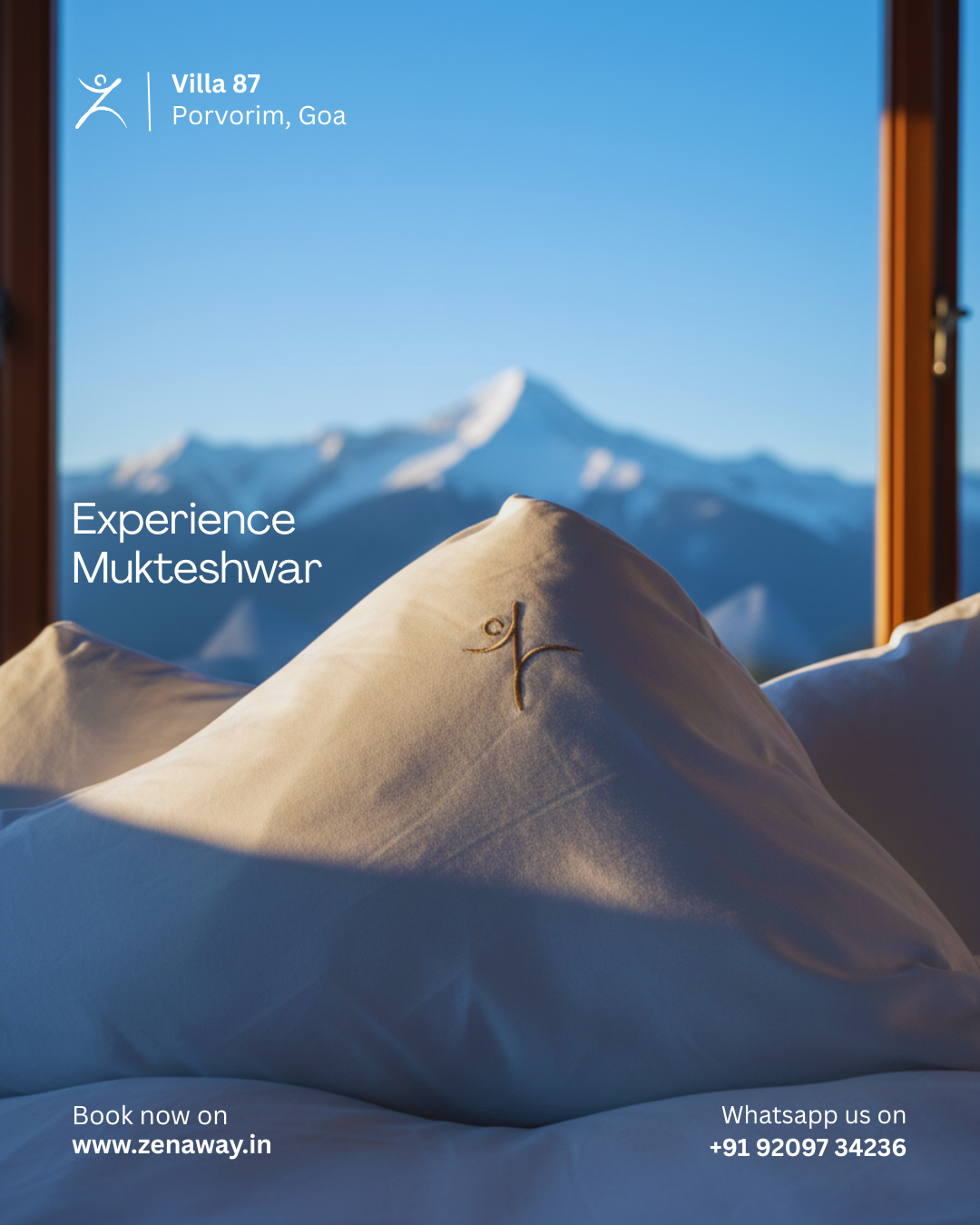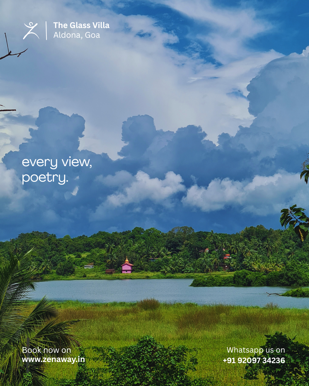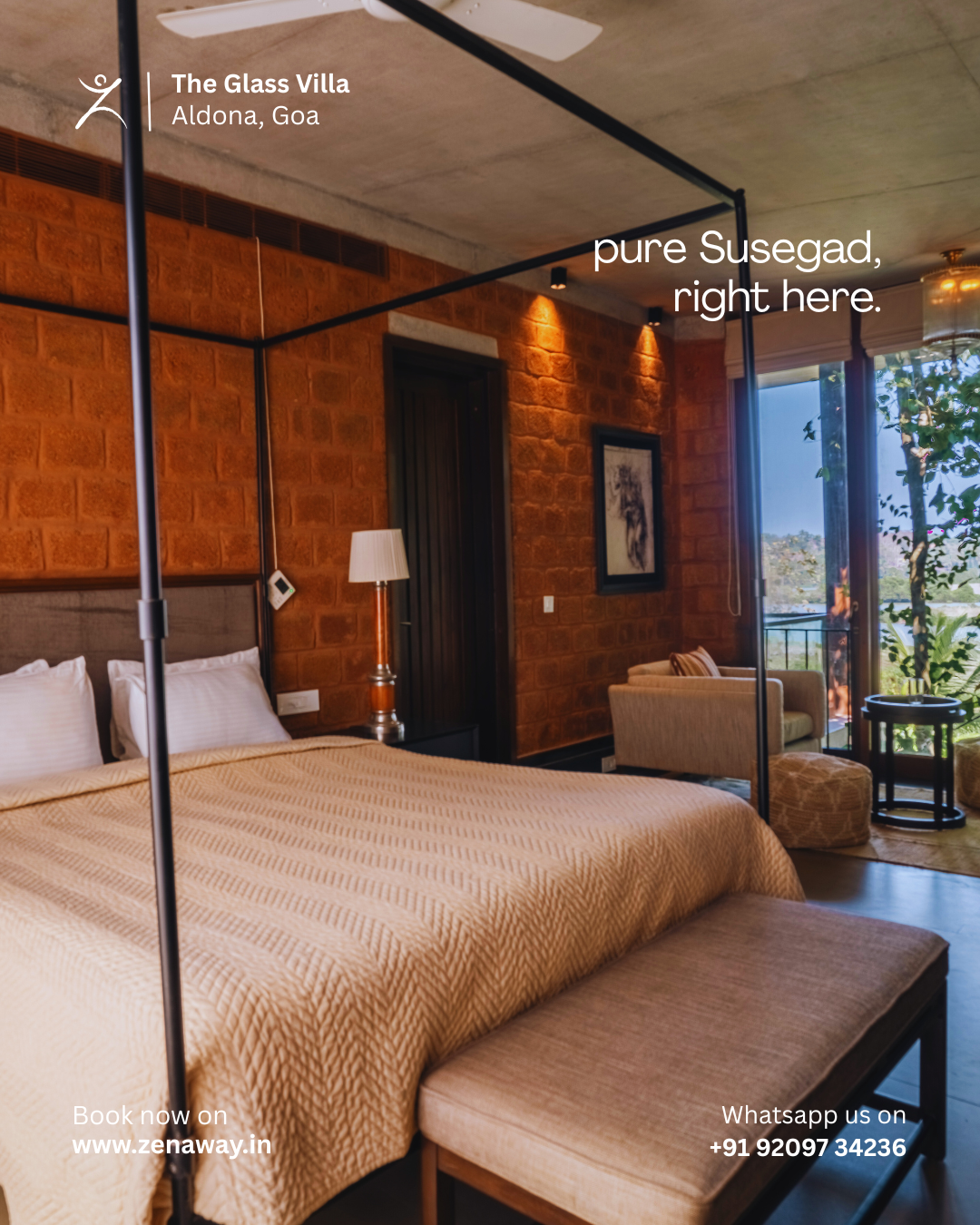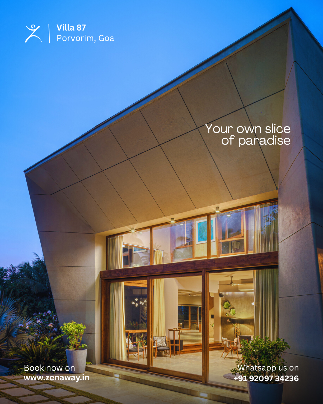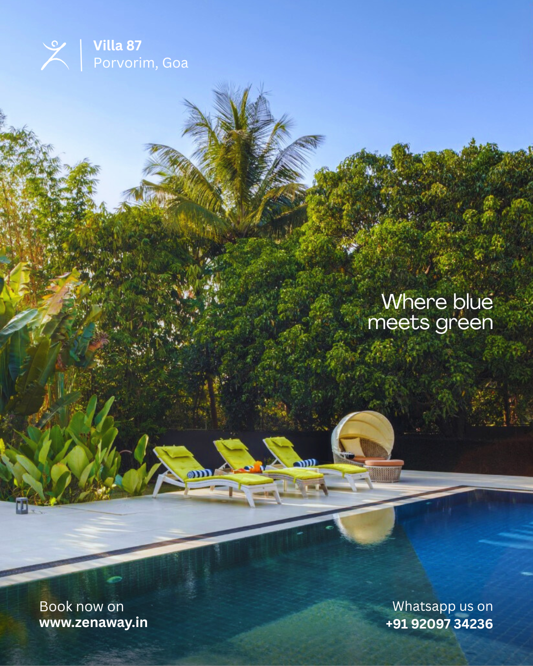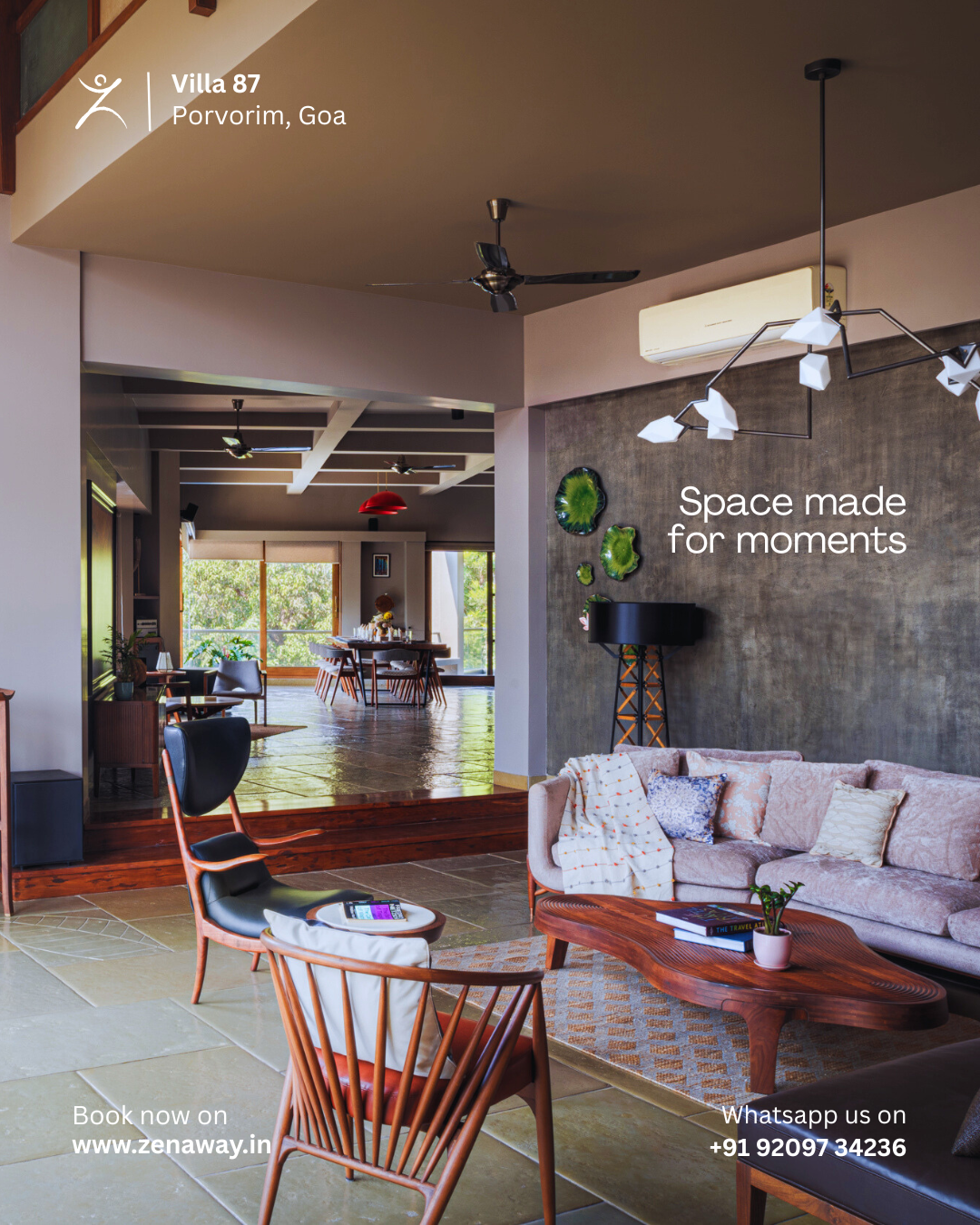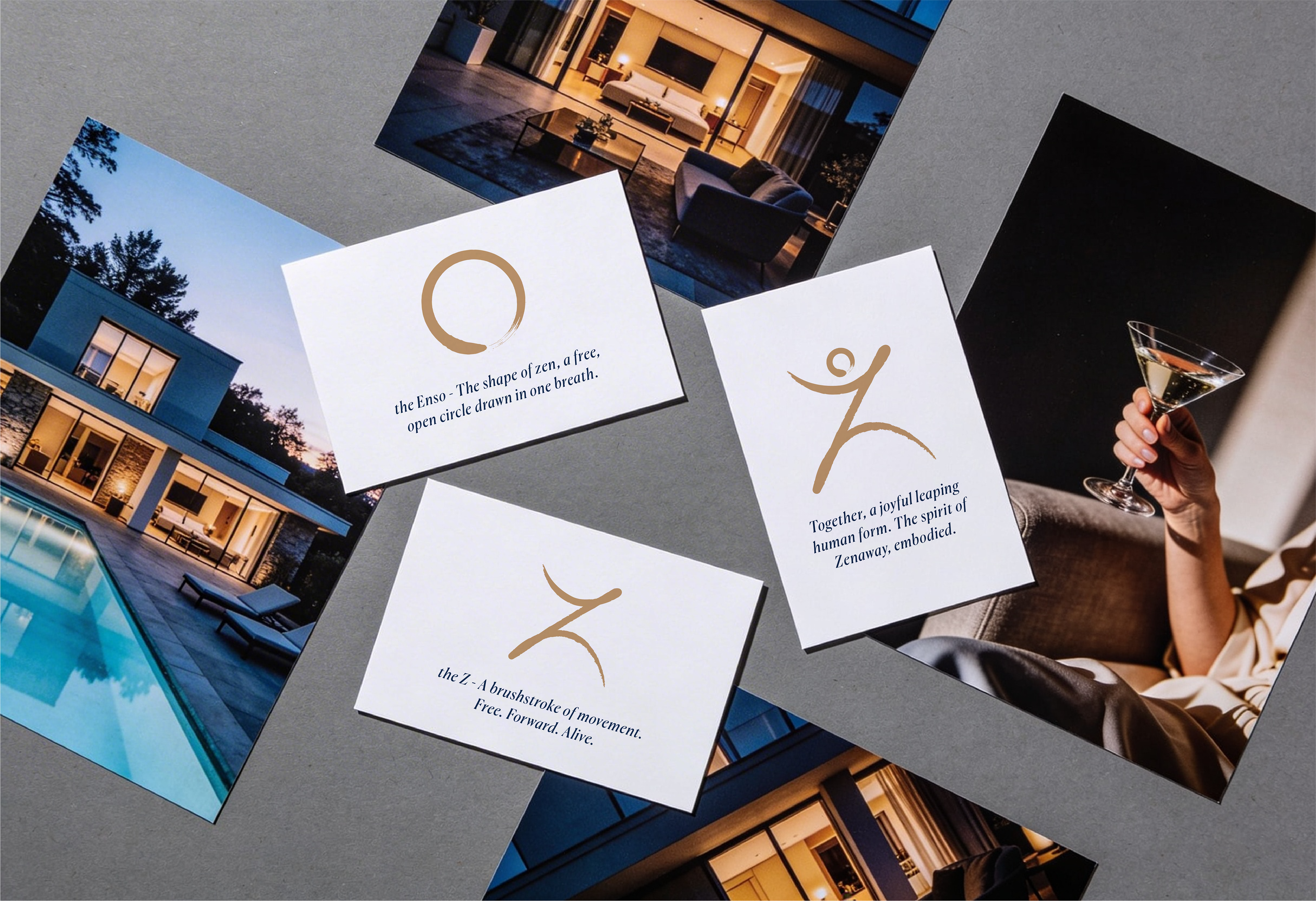
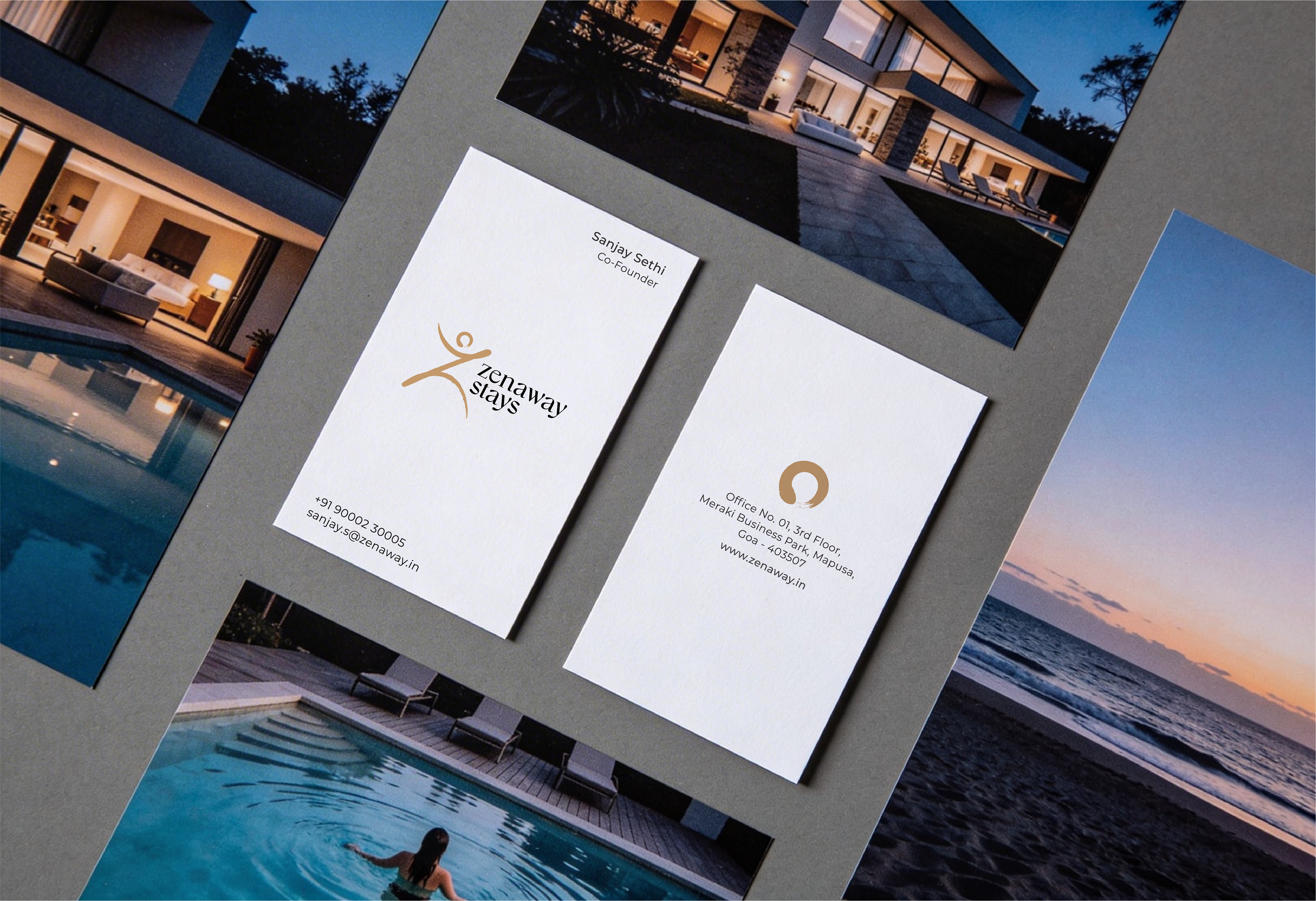
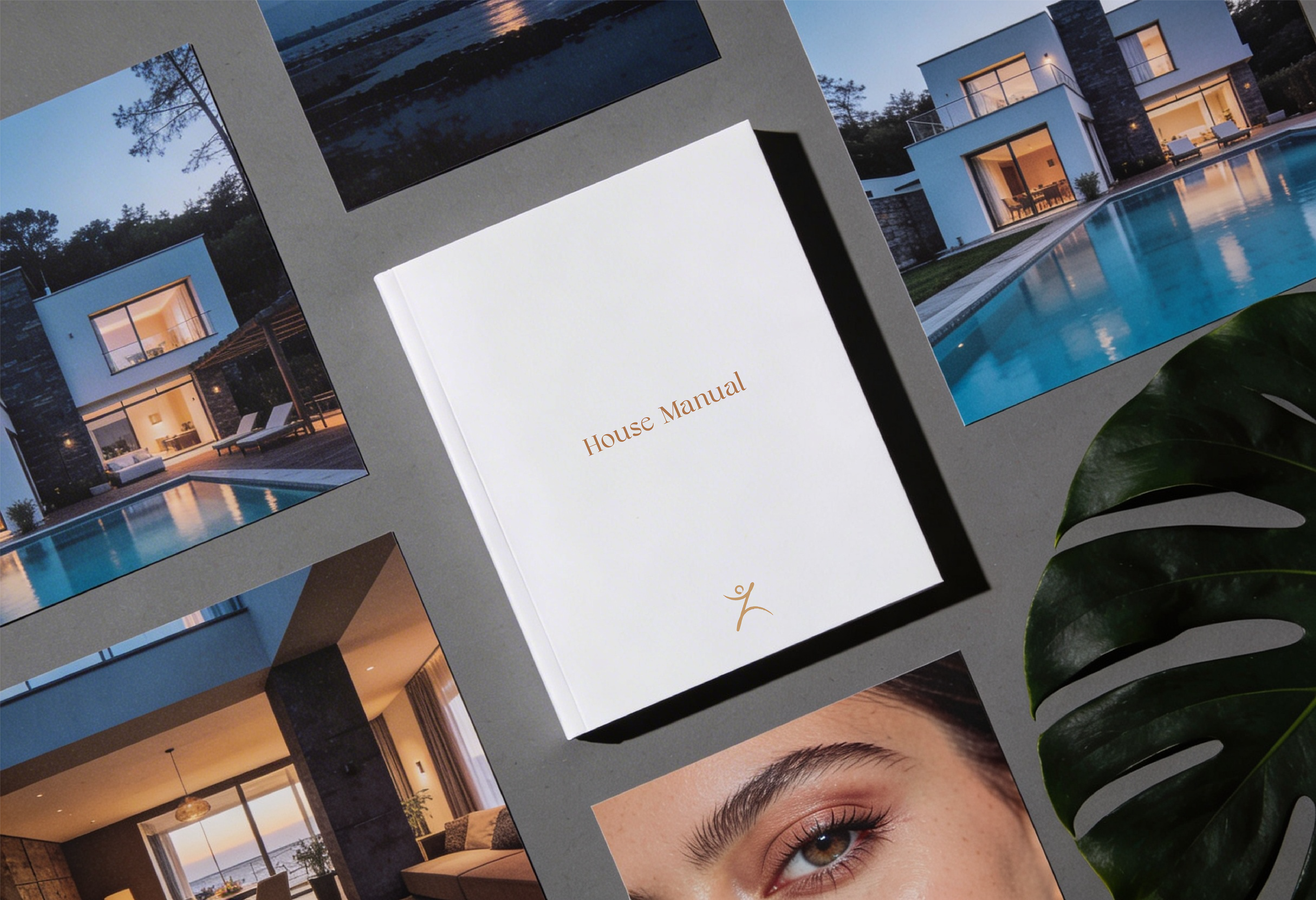
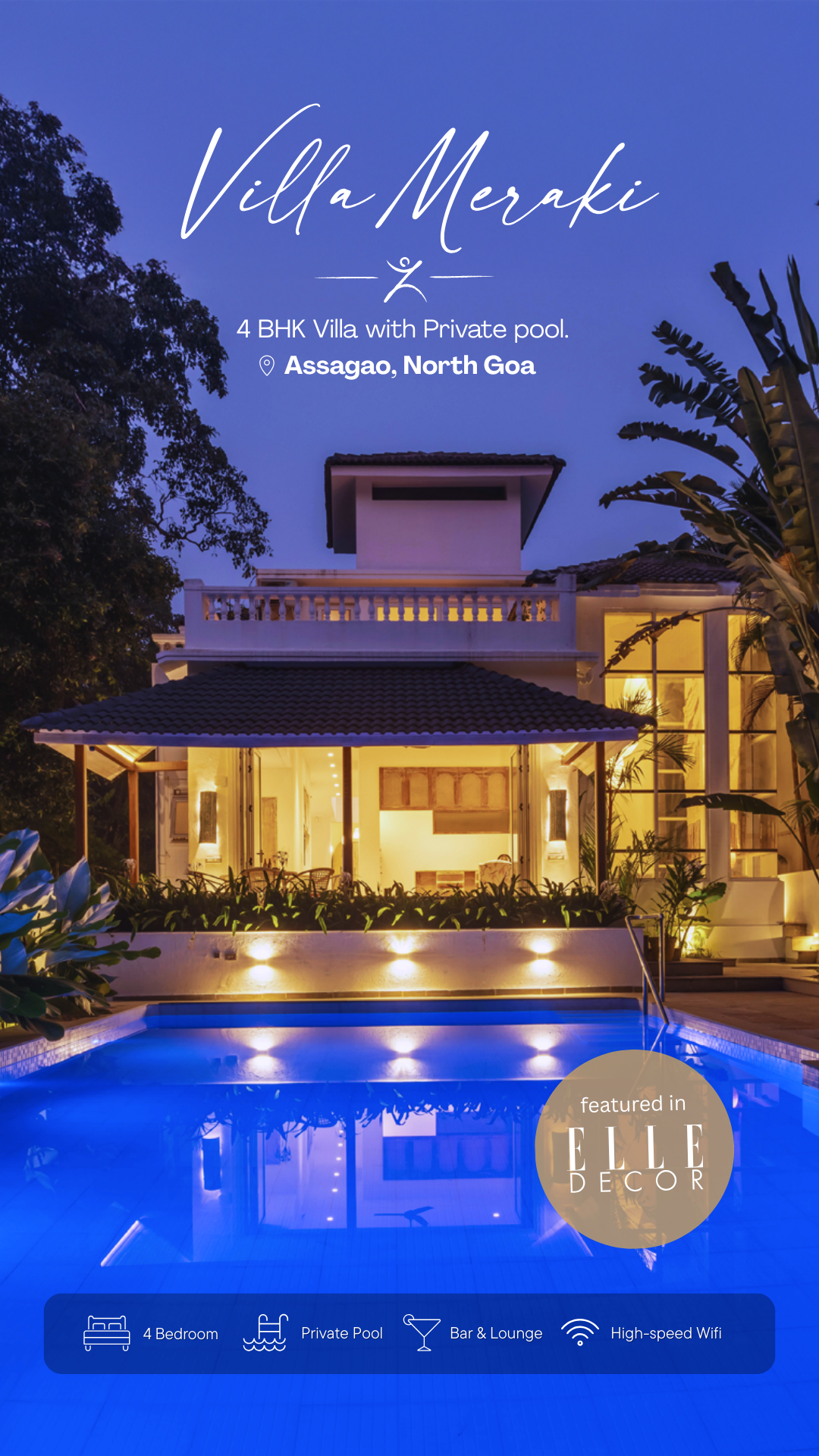
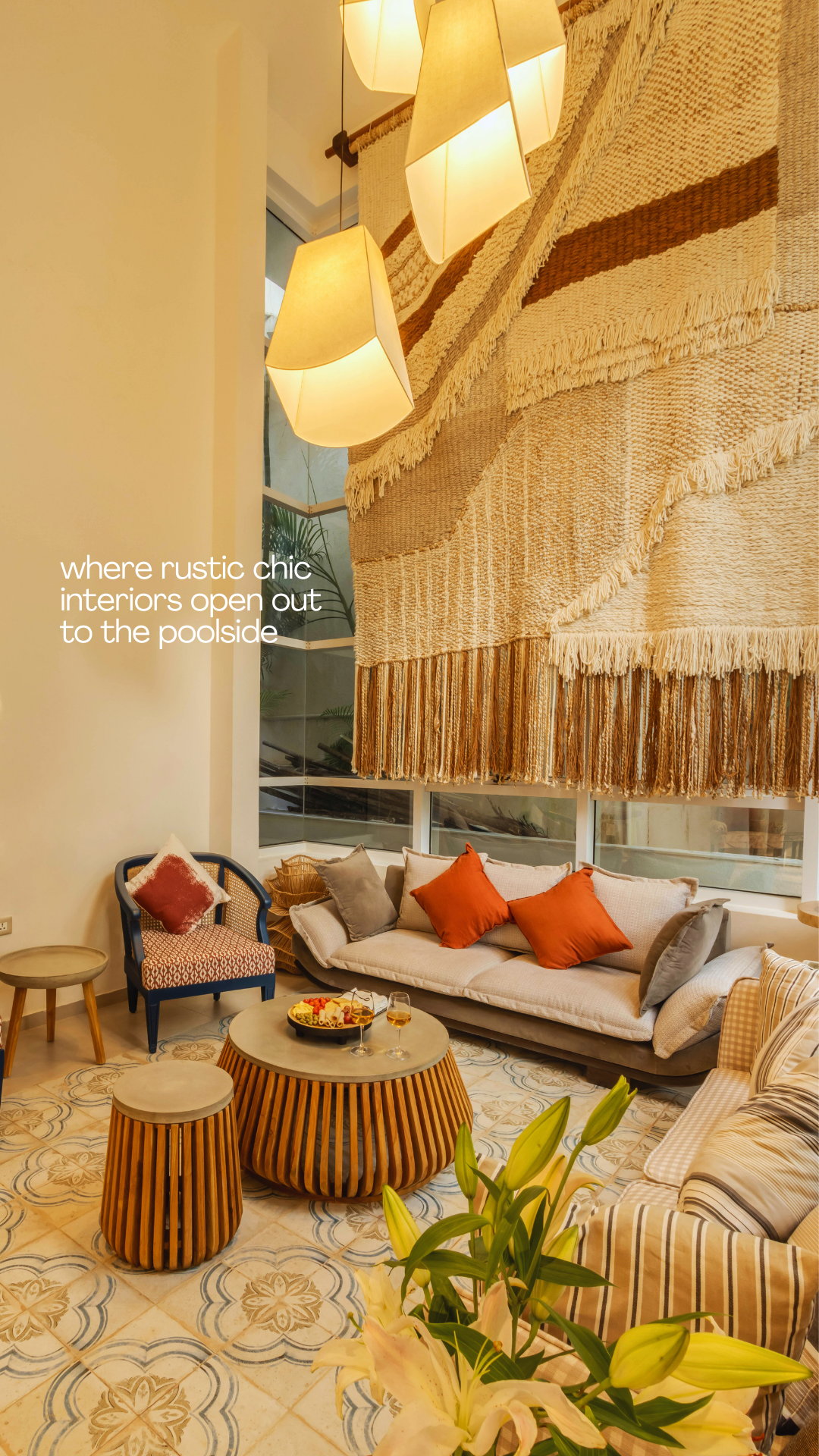
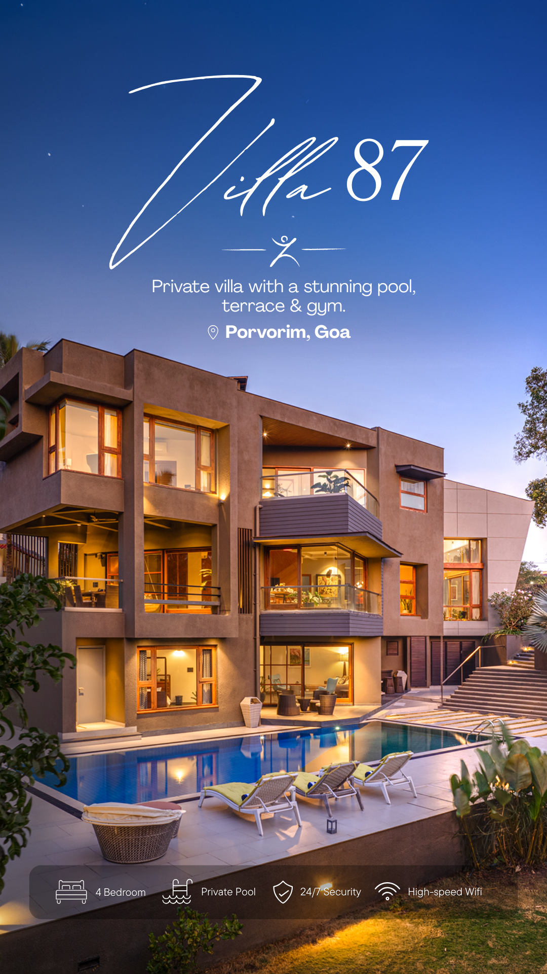
The visual language was built on restraint. Clean white space, classic layouts, and a minimalist design system foreground architecture, light, and materiality. That sensibility extended across every physical surface a guest encounters within the homes: welcome cards, eco-friendly notes, vacation home manuals, coasters, menu cards, and departure letters, each conceived not as collateral, but as curated objects that feel like they simply belong.
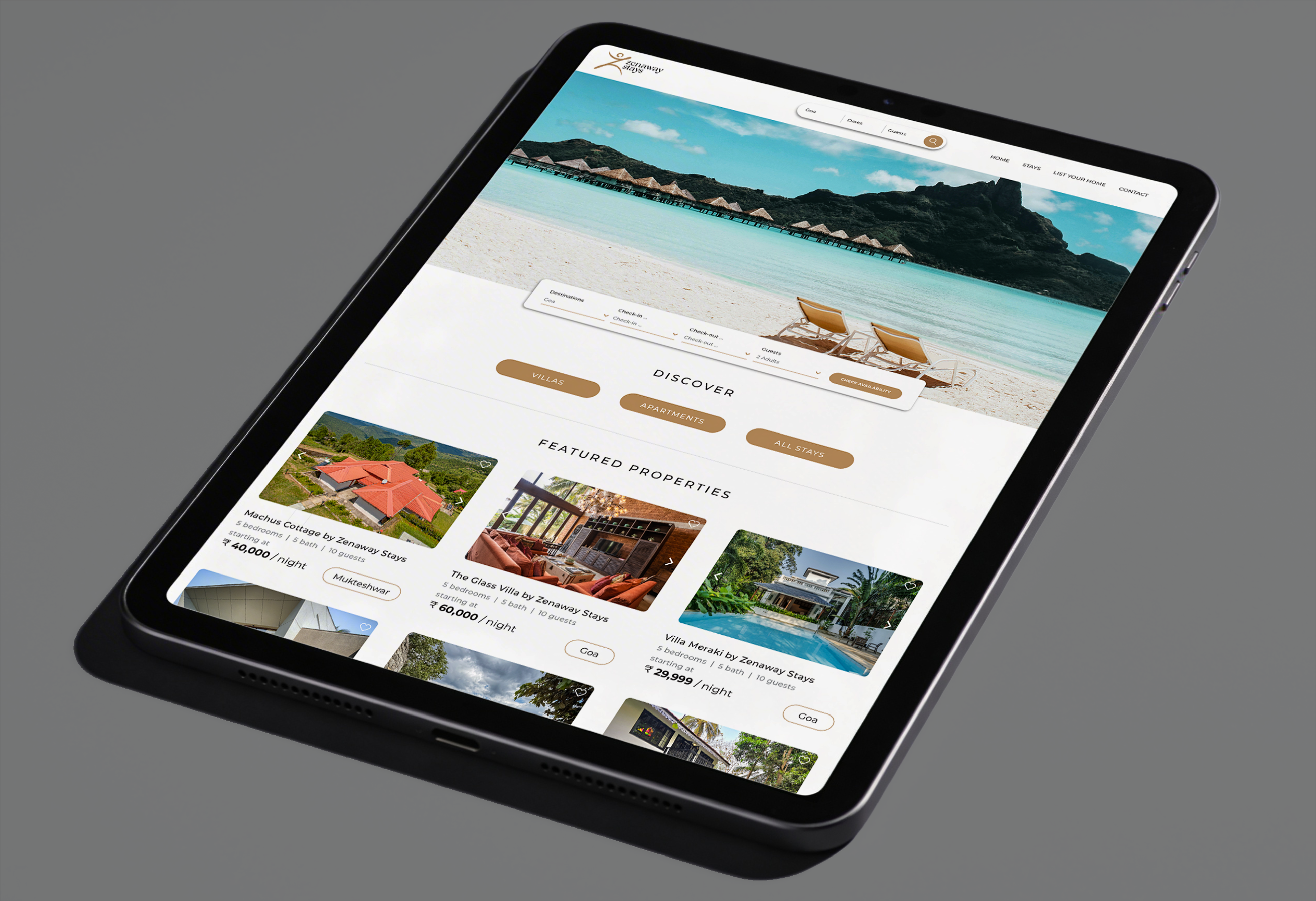
The digital presence was built by mapping the complete guest journey, identifying every touchpoint where the brand could connect with clarity and warmth. The website, Instagram biosite, and social media were developed as seamless extensions of the same visual world, with handle optimisation applied to strengthen SEO reach and engagement. Across every platform and every printed surface, Zenaway holds one tone: refined, considered, and unhurried.